Category Layouts
Use a category menu item to take customers directly to a list of documents. You can link to a single category, display the full catalog, or create a featured-products page.
Choose a layout
When you create the menu item, choose one of these types under Documents Seller. The type sets the layout for this menu item.
| Menu item type | What customers see |
|---|---|
| Category Default Layout | A vertical list with space for each document's image and description. |
| Category Column Layout | Documents side by side. Set Number Of Columns In Column Layout in Documents Seller → Configuration → Themes. View the columns example. |
| Category Table Layout | A compact table with one document per row. Use it when customers need to scan names and prices. View the table example. |
| Category Grid Layout | A grid of document cards. Use it for an image-led catalog with column and card settings on the menu item. |
Customers can open a document's details from the listing. The available order or download action depends on the document and the customer's access.
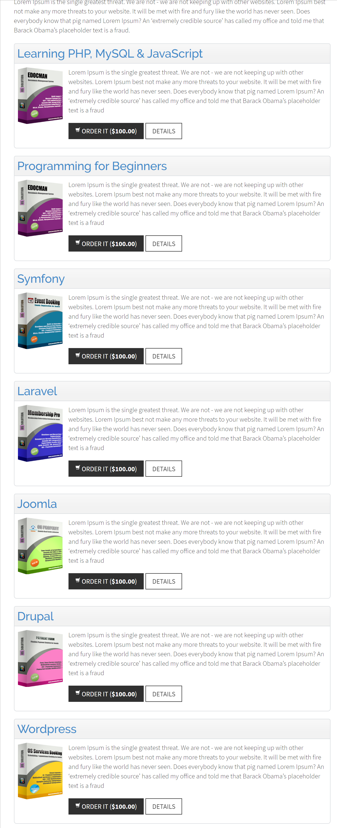
Choose which documents to display
- Select Category limits the list to documents assigned to the selected category. Leave it set to Top to list documents across the catalog. Listings show published documents that the visitor can access.
- Only Show Featured Documents narrows the list to documents marked Featured. It works both for a selected category and with Top.
- A selected category's page also links to its visible subcategories. To include their documents in the parent listing, enable Show Documents From Children Categories in Documents Seller → Configuration → General. This includes documents from published subcategories at deeper levels as well.
For page size, sorting, and other shared display options, see Storefront Display and URLs.
Configure the document grid
- Number Columns sets how many document cards appear per row. Choose 2, 3, 4, or 6. The default is 3.
- Document Item Layout controls the card design. Choose Default or Image Top. Use Image Bottom only if your Joomla template supplies an override for that layout.
- With Image Top, set Enable Hover Effect to Yes to highlight cards on hover. Use Hover Background Color and Hover Text Color to customize the effect, or leave the fields blank for the default colors.
The grid template displays the selected category's description when one exists. In the current version, Show Category Description and Description Length Limit on the Category Grid Layout menu item have no effect on the displayed text.