Categories List
Use a categories menu item as an entry point to your catalog. Customers choose a category to see its documents and any subcategories they can browse. For example, a Templates menu item can list Business Templates and Design Templates as separate links.
Choose a layout
When you create the menu item, choose one of these types under Documents Seller.
| Menu item type | What customers see |
|---|---|
| Categories List | A vertical list. Use it when customers need room to read each category's description. |
| Categories Columns Layout | Categories side by side. Set Number Columns to 2, 3, 4, or 6. The default is 3. |
| Categories Grid Layout | A grid of category cards with a choice of image placement. Set Number Columns to 2, 3, 4, or 6. The default is 3. |
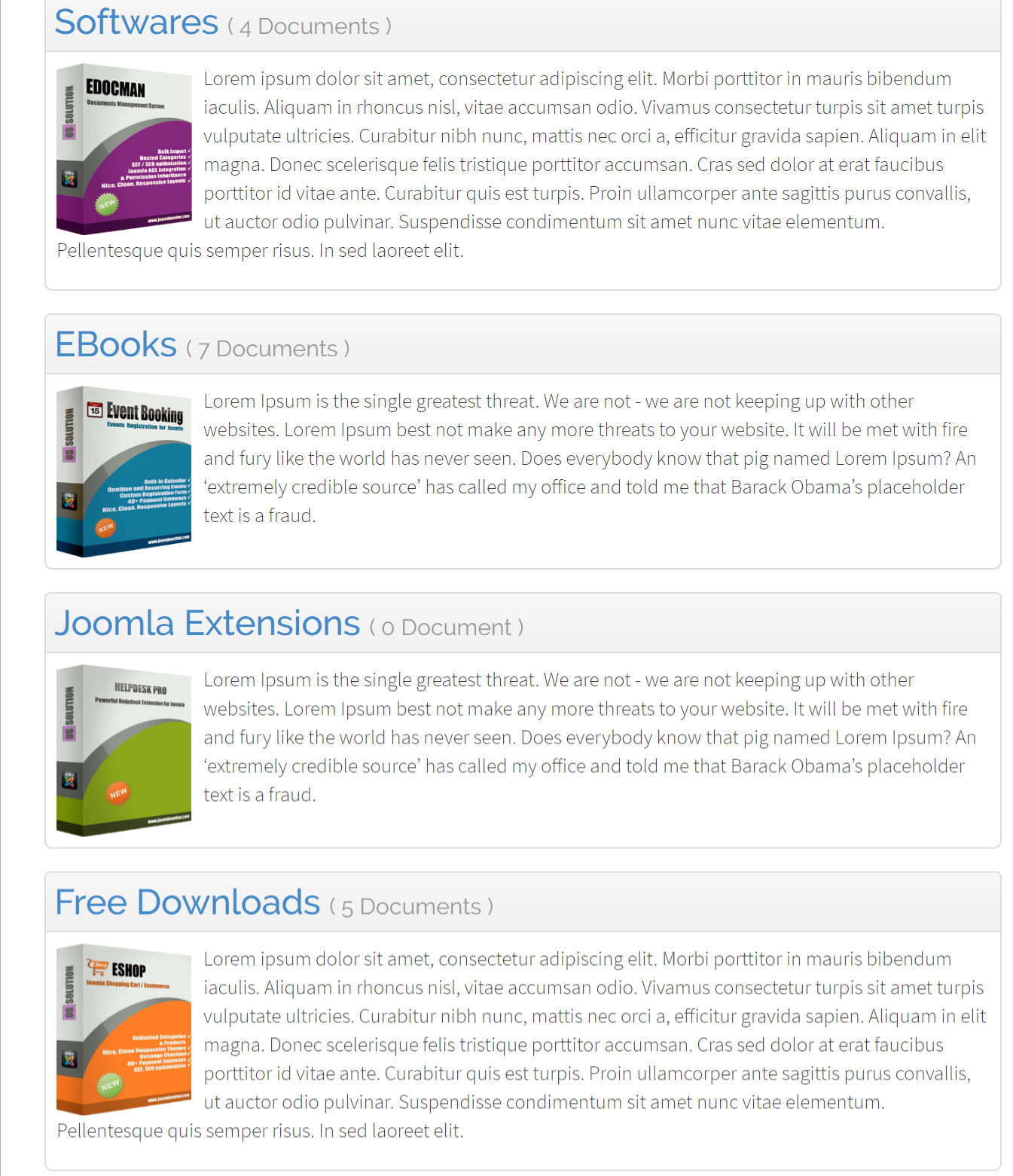
Choose which categories to list
Set Select Category to Top to list top-level categories. Select a parent category to list its immediate subcategories. Each entry in the list must be published and available at the visitor's viewing access level. To link directly to a category's documents, use one of the Category Layouts.
Use Categories Per Page in Documents Seller → Configuration → Themes to set the page size. Enable Show Number of Documents on the same tab to show a document count beside each category.
Choose the layout customers see after clicking a category
Set Category Layout to Use Category Setup to use the layout saved on each category. To apply the same document layout to pages reached through this categories menu item, choose Default Layout, Columns Layout, Table Layout, or Grid Layout.
If a category link opens through a dedicated Category menu item, that item's layout takes precedence. When you choose Grid Layout, set Document Item Layout to Default or Image Top. See the Category Layouts grid settings for details.
Configure the category grid
- Category Item Layout controls how each category card is displayed. Choose Default, Overlay (category name over the image), Image Top, or Image Bottom.
- Show Category Description adds the description to each card. Use Description Length Limit to shorten it, or leave the value at
0to show the full description. These settings are available for Default, Image Top, and Image Bottom. - Enable Hover Effect adds a hover effect to cards in those same three layouts. Use Hover Background Color and Hover Text Color to customize the effect, or leave the fields blank to use the default colors.