Extra Field Groups & Extra Fields
[TOC]
Overview
OS Property's extra fields system lets you extend the default property form with custom data fields tailored to your website's needs — for example, "Number of Bedrooms", "Floor Area", "Year Built", or "Swimming Pool".
Extra fields are organised into Extra Field Groups, which control how the fields are presented on the property form. Each group acts as a labelled section that contains one or more fields. Extra fields can also be restricted to specific property types, so each type of property only displays the fields that are relevant to it.
Extra Field Groups
Overview
Extra field groups are containers that organise custom fields into logical sections on the property edit form. A group can be assigned an access level so that only specific Joomla! user groups can see its fields.
Groups List
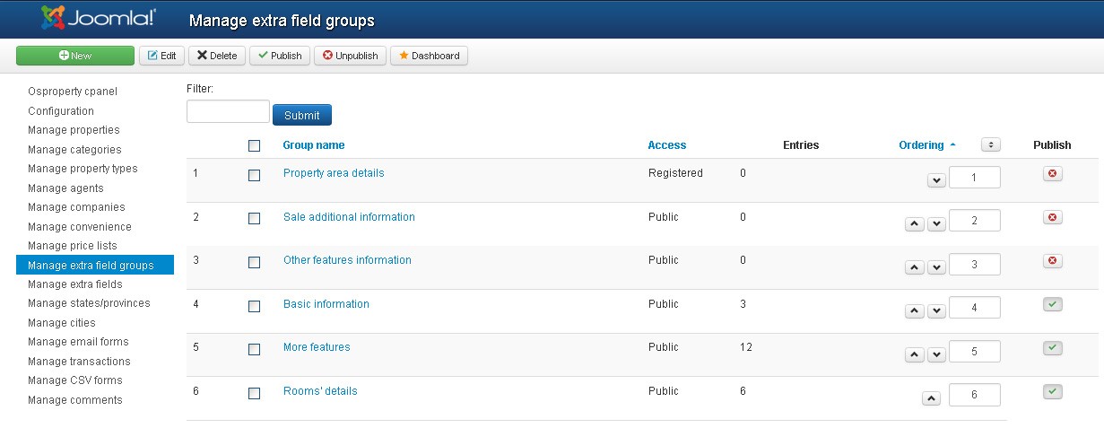
From the Extra Field Groups panel you can view, create, edit, reorder, publish, unpublish, and delete groups.
Add / Edit a Group
To add a new group, click the New button. To edit an existing group, click on its name.
| Field | Description |
|---|---|
| Field Group Title | The display name of the group shown as a section heading on the property form |
| Access | The Joomla! user group that can see this field group |
| Published | Controls whether the group and its fields are visible |
Multiple Languages
When your Joomla site has more than one language, a Translation tab will appear.
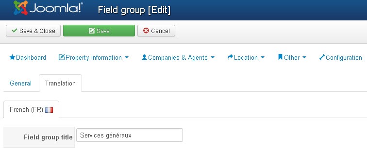
| Field | Description |
|---|---|
| Field Group Title | Title of the field group in the corresponding language |
Extra Fields (Custom Fields)
Overview
Extra fields are the individual custom data fields that appear on the property edit form. Each field belongs to a group and can optionally be restricted to one or more property types.
Fields List
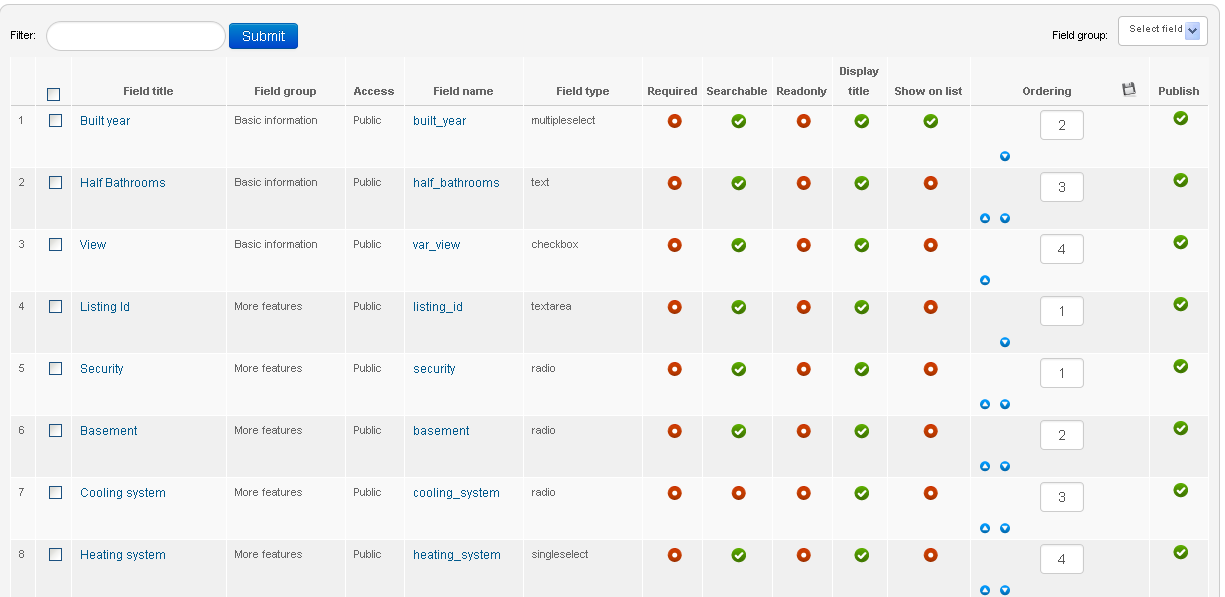
The list displays all extra fields in the system. Use the filters to narrow the list by field group or property type.
| Column | Description |
|---|---|
| Field Title | Display label of the field |
| Field Group | The group this field belongs to |
| Access | Access level controlling which users can see this field |
| Field Name | Unique system identifier for the field (no spaces or special characters) |
| Field Type | The type of input (see Supported Field Types below) |
| Required | Whether a value must be entered before saving a property |
| Searchable | Whether this field appears in the advanced search form and search module |
| Read Only | Whether the field is display-only and cannot be edited by agents |
| Display Title | Whether the field label is shown on the front-end property detail page |
| Show on List | Whether the field value appears on the property listing page |
| Ordering | Display order within the field group |
| Published | Whether the field is active and visible |
| Property Types | The property types this field applies to |
Supported Field Types
| Field Type | Description |
|---|---|
| Text | Single-line text input. Supports configurable width (Size), maximum length (Maxlength), value type (Text / Integer / Decimal), and an optional clickable link mode for URLs or email addresses. |
| Textarea | Multi-line text input. Supports configurable columns (ncols) and rows (nrows). |
| Single Select | Dropdown list allowing the selection of one option. |
| Multiple Select | Dropdown list allowing the selection of multiple options. |
| Checkbox | A group of checkboxes allowing multiple selections. |
| Radio | A group of radio buttons allowing a single selection. |
| Date | A date picker input. |
Add / Edit a Custom Field
To add a new field, click the New button in the toolbar. To edit an existing field, click on its title.
| Field | Description |
|---|---|
| Field Type | The type of input (see Supported Field Types above) |
| Field Group | The extra field group this field belongs to |
| Field Name | Unique system identifier. No spaces or special characters allowed. |
| Field Title | Display label shown on the property form |
| Required | If Yes, agents and administrators must enter a value before saving a property |
| Read Only | If Yes, the field displays information only and cannot be edited |
| Searchable | If Yes, this field appears in the advanced search form and search module |
| Display Title | If Yes, the field label is shown on the front-end property detail page |
| Show Description | If Yes, the description is shown as a tooltip on the front-end |
| Description | Help text shown as a tooltip on the property form |
| Default Value | Pre-filled value when creating a new property |
| Access | The Joomla! user group that can see and use this field |
| Property Type | The property types this field applies to. Leave blank to apply to all types. |
Note: For Text fields, you can additionally define a Value Type: Text, Integer, or Decimal. Integer and Decimal types restrict the field to numeric input only.
Text Field: Additional Attributes
| Attribute | Description |
|---|---|
| Value Type | Text, Integer, or Decimal |
| Size | Width of the input box in pixels |
| Maxlength | Maximum number of characters allowed |
| Clickable | If Yes, the value is rendered as a clickable link on the front-end (useful for URLs or email addresses) |
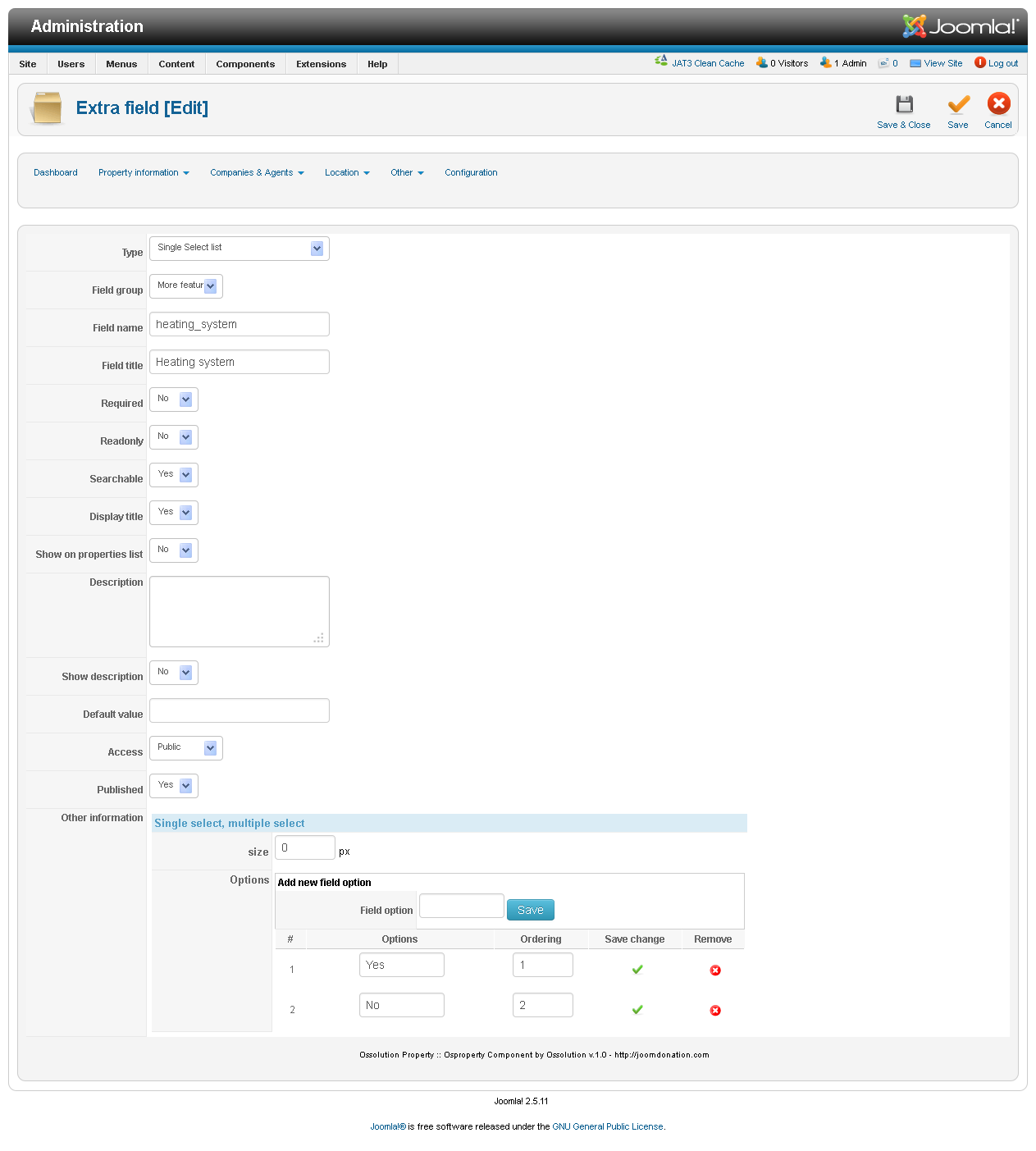

Managing Options (Select, Checkbox, Radio Fields)
For fields of type Single Select, Multiple Select, Checkbox, or Radio, you must define the list of available options.
When creating such a field for the first time, a text area is shown where you can enter all options (one per line). After saving the field, a dedicated Options Manager appears at the bottom of the edit page, allowing you to add, edit, and remove individual options without reloading the page.
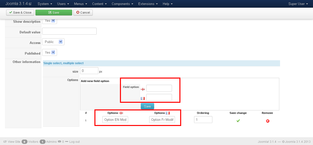
Important: When your Joomla site has multiple languages, you must enter each option in all available languages. Language flags next to each option make it easy to identify which languages still need to be filled in.
Multiple Languages
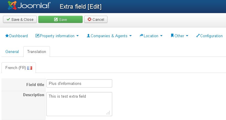
When your Joomla site has more than one language, a Translation tab will appear on the field edit page.
| Field | Description |
|---|---|
| Field Title | Display label in the corresponding language |
| Description | Tooltip description in the corresponding language |